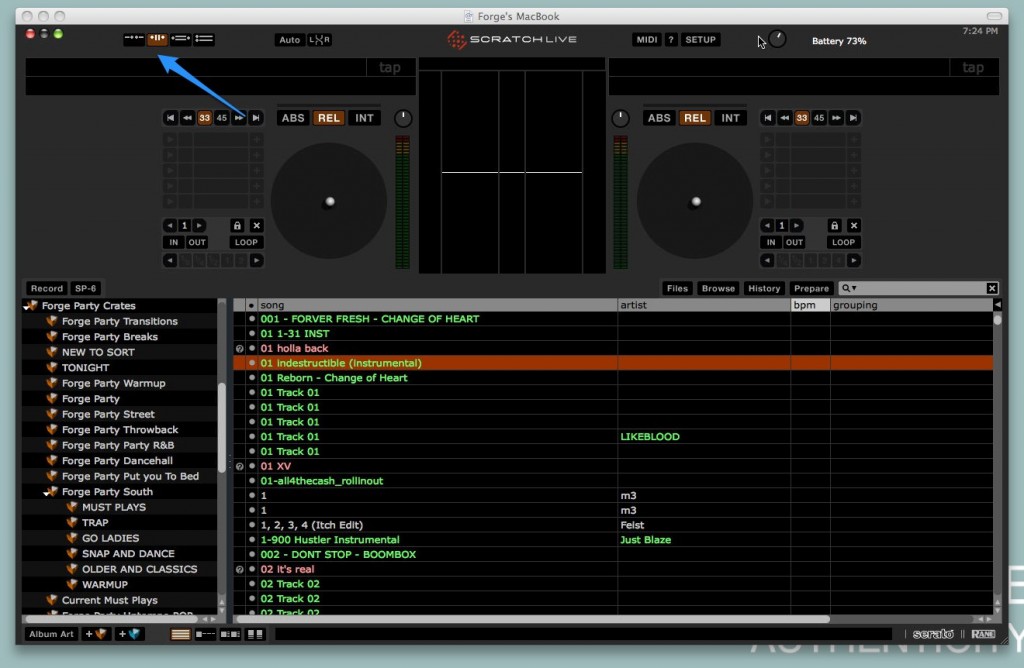
Since the 2.0 update of Scratch Live there have been multiple views available for you to select in the upper left area of the screen.  The default is the view that we’re all familiar with with larger waveforms, but if you click the view to the left of that you’ll see the waveforms go away, leaving the library as the focus on the screen (library view).  This view is awesome for DJs like me who have laptops with screens smaller than 15″ because it gives you much more screen real estate for browsing your crates and finding tracks (especially helpful when you have the prepare crate open at the same time). Note the place to change views and the difference between the two in the screen shots below:
But here’s a handy tip I just came across (totally on accident!) this past weekend. Â You can switch between the default view and library view simply by pressing the space bar on your keyboard. Â Tap it once to go into library view, and tap it again to go back to the default view (note this will not work if you have the cursor in the find/search field). Â This quick switching has literally made me reconsider my next laptop purchase from a 15″ to 13″ again (although having a 15″ would make for amazing screen real estate in library view). Â Try it out!

